Podcasters are audio people, which means they often ignore the visual side of their show. But Apple Podcasts and Spotify are highly visual platforms. Before a stranger ever hears your voice, they judge your cover art. If your artwork looks amateur, they will assume your audio sounds amateur. In this episode, Mark breaks down the fatal mistakes podcasters make with their logos. Learn the "50-Pixel Test," why you should never put a microphone in your artwork, and the design rules that will make your show pop off the screen.
Show Notes
The "First Impression" Reality: * Why your cover art is the hardest-working piece of marketing real estate you own.
Humans process images 60,000 times faster than text. If the art is bad, they don't read the title.
The Cliché Trap:
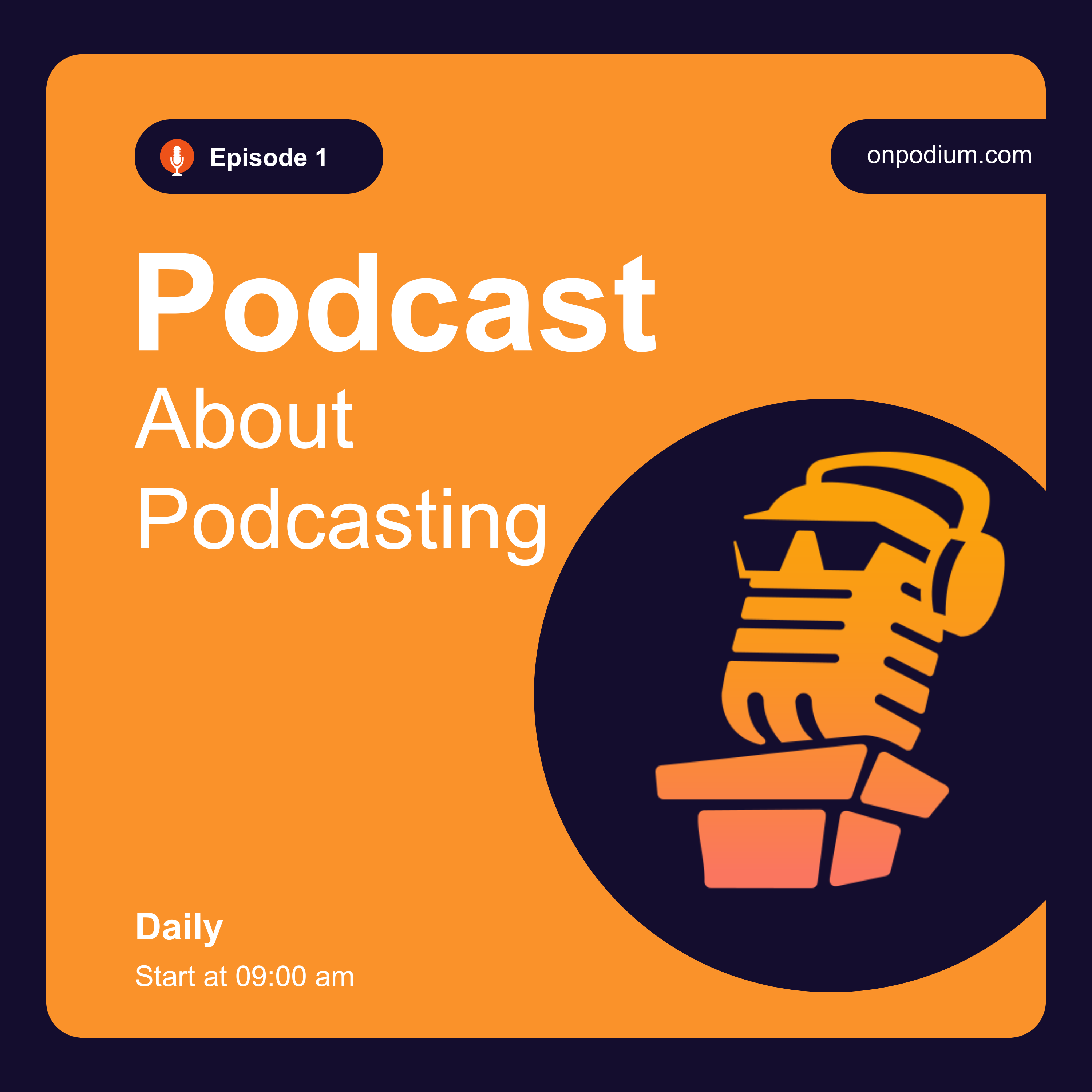
Why you must ban microphones, headphones, and sound waves from your logo. Every beginner uses them, and it screams "amateur."
The "50-Pixel Test":
The most important design rule in podcasting. Your art is a 3000x3000px square, but it will be viewed at 50x50px on a smartphone screen.
If you cannot read the title when the image is shrunk down to the size of a postage stamp, your design has failed.
The Rule of Text:
Limit your cover art to 4 words maximum.
Drop the word "Podcast" from the art (it's redundant).
Use thick, bold, sans-serif fonts for maximum legibility.
Color Psychology:
Why high-contrast, bright background colors (Yellow, Neon Blue, Orange) perform better in a dark-mode UI environment like Spotify.
Mark onpodium.com
Listen On
Also In Season 1
-
Stop Using Boring Episode Pages - The Immersive Marketing Shift
The era of the boring, static podcast episode page is completely dead. If you ar -
The Milestone Episode (How to Celebrate Without Being Self-Indulgent)
Reaching Episode 50 is a massive statistical achievement in an industry where mo -
Why Your Audience is Lonely (Building a Podcast Community)
A podcast is a one-way street. You speak, and thousands of people listen in tota -
Why Nobody Buys Your Podcast Merch (The "Inside Joke" Strategy)
When a podcaster gets their first 500 listeners, they usually get overly excited