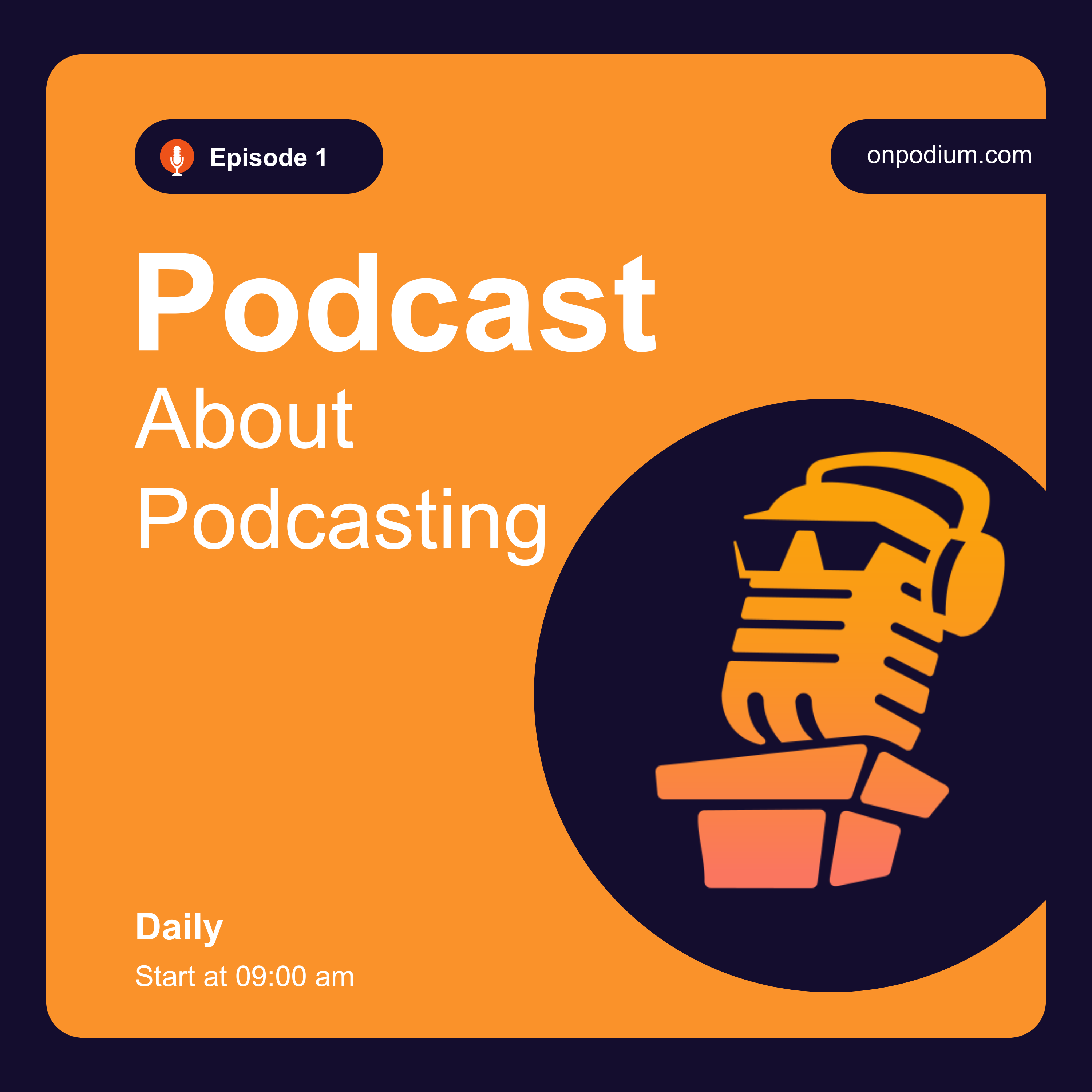
For years, podcast apps only displayed one image: Your main show cover art. But the major platforms (Apple Podcasts and Spotify) have recently updated their user interfaces to behave much more like YouTube. Now, when a user scrolls through their feed, the app prominently displays "Episode-Specific Artwork." If you are still attaching your standard show logo to every single MP3 file you upload, your feed looks like a boring, repetitive wall of identical squares. In this episode, Mark explains the necessity of Visual SEO. Learn why you must treat podcast episodes like YouTube videos, how to design a high-converting thumbnail template, and why putting your guest's face on the artwork drastically increases your Click-Through Rate.
Show Notes
The Platform UI Shift:
How Apple Podcasts (iOS 17+) and Spotify have redesigned their feeds to prioritize episode-level images over show-level images.
Why the "Wall of Sameness" causes listeners to scroll past your new releases.
The YouTube Thumbnail Mentality:
Podcasts are now competing in a visual attention economy. Your audio file needs a billboard.
Why a custom image converts "scanners" into "listeners."
The Anatomy of Great Episode Art:
The Face: Humans are biologically wired to look at faces. Put a massive, high-res cutout of your guest's face on the artwork.
The Text Hook: Do not just write the episode title. Write a 3-word "Hook" that triggers curiosity.
The Branding: Keep your colors and fonts consistent so it still feels like your show.
The Workflow Hack:
Don't spend an hour on this. Build a master template in Canva.
How to swap the photo, change the three words of text, and export the file in under 90 seconds.
Action Step: * Open Canva today. Create a 3000x3000px template with a placeholder for a guest photo and a bold text box. Use it for your next release.
Listen On
Also In Season 1
-
Stop Using Boring Episode Pages - The Immersive Marketing Shift
The era of the boring, static podcast episode page is completely dead. If you ar -
The Milestone Episode (How to Celebrate Without Being Self-Indulgent)
Reaching Episode 50 is a massive statistical achievement in an industry where mo -
Why Your Audience is Lonely (Building a Podcast Community)
A podcast is a one-way street. You speak, and thousands of people listen in tota -
Why Nobody Buys Your Podcast Merch (The "Inside Joke" Strategy)
When a podcaster gets their first 500 listeners, they usually get overly excited